Claire Hill Design
Brand Refresh
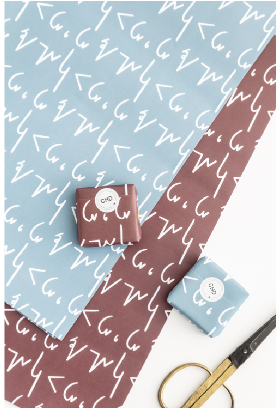
Claire came to me with a brand that she felt was a little basic and not quite finished. She really wanted to expand her brand with a recognisable logo mark, multiple lock ups and alternate logos she could use across her packaging with several patterns to be used both on her website and for packaging.
We also refreshed her colour palette and brand fonts - and watch this space for some amazing packaging upgrades!


